Project Scope: 6 weeks
Project Type: Group of 3
Role: Logo, Visual design, Iconography, Layout, Moderator
Tools: Axure
Overview
The Switch app is for anyone who has ever argued over whose turn it is to take out the garbage or pick the next TV show. Switch is an application that will facilitate turn-taking and the sending of IOUs.
Users will be able to add a series of switches, dials, and counters to their home page, allowing them to keep track of whose turn it is and who owes whom how much money.
Users can create groups of users to share switches and keep track of shared chores or privileges-with switches, keeping track of tasks between two people and dials keeping track of tasks between 3 or more people.
Project Goals
Simplicity is key - our app concept in general is simple yet effective for the user in their everyday lives. We want to make sure that the design and hierarchy of the page is very intuitive to the user.
Allow the user to have control - the user should have free reign on adding/editing any groups, tasks, or payments in the app.
Consistency between mobile and desktop - the user should be able to have a similar experience between either channel. Branding and layout should help make it clear that both allow the same tasks to be performed.
LO-FI Design Charrettes
MID-FI Prototype
For our Mid-Fi prototype, we chose one scenario that had four tasks to complete:
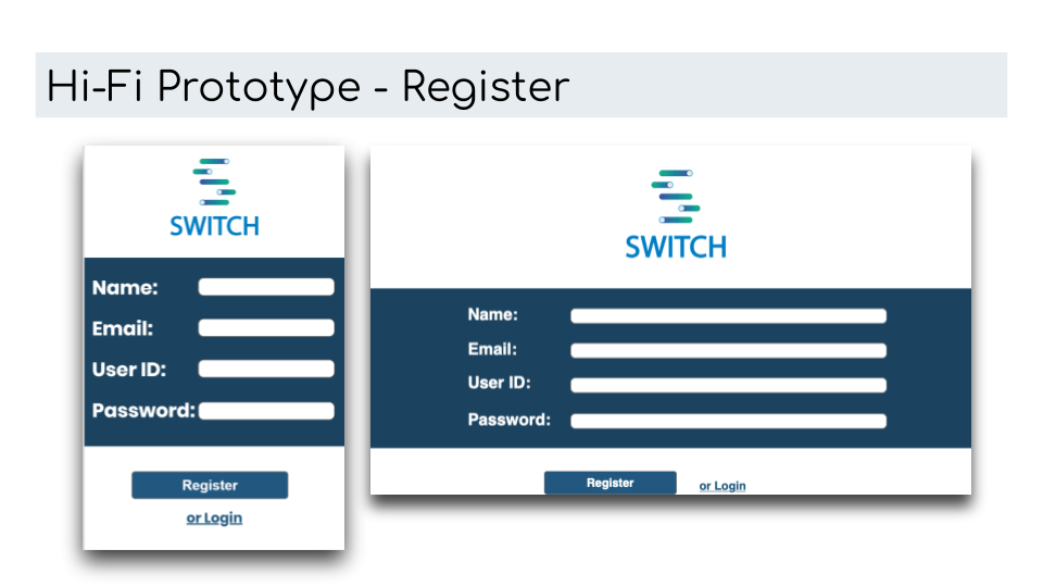
Create an account
Add a new group
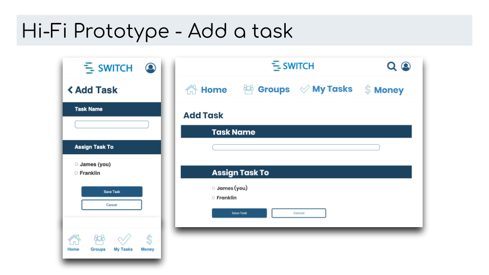
Add a new task to the group
Send a reminder
Add a new group
Add a new task to the group
Send a reminder
View Prototype:
Usability Testing
Goals of usability testing:
Test usability of the features: weaknesses in the navigation structure, are icons supporting words easy to understand, ease of completing the assigned tasks.
Test usability of the features: weaknesses in the navigation structure, are icons supporting words easy to understand, ease of completing the assigned tasks.
Observation: view participants' difficulty, uncertainty, and hesitations.
Evaluate the user expectations: did the prototypes have the features needed to satisfy the participant needs; recommendations for better usability.
Recruitment Plan:
Participants will be people who live with at least one other person. Those that fit the roommate demographic, which would consist of college students and young adults, will specifically be targeted. They can be recruited on college campuses and University towns.
Testing Method:
In-person using the mid-fi prototype on mobile and desktop
Testing Location & Device Type:
Due to the locations of the group members, the test will take place at various locations, days, and times during the week. Each test was performed half on a laptop or desktop and half on a mobile phone.
Style Guide
HIFI Prototype
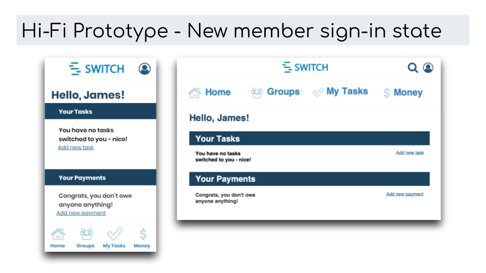
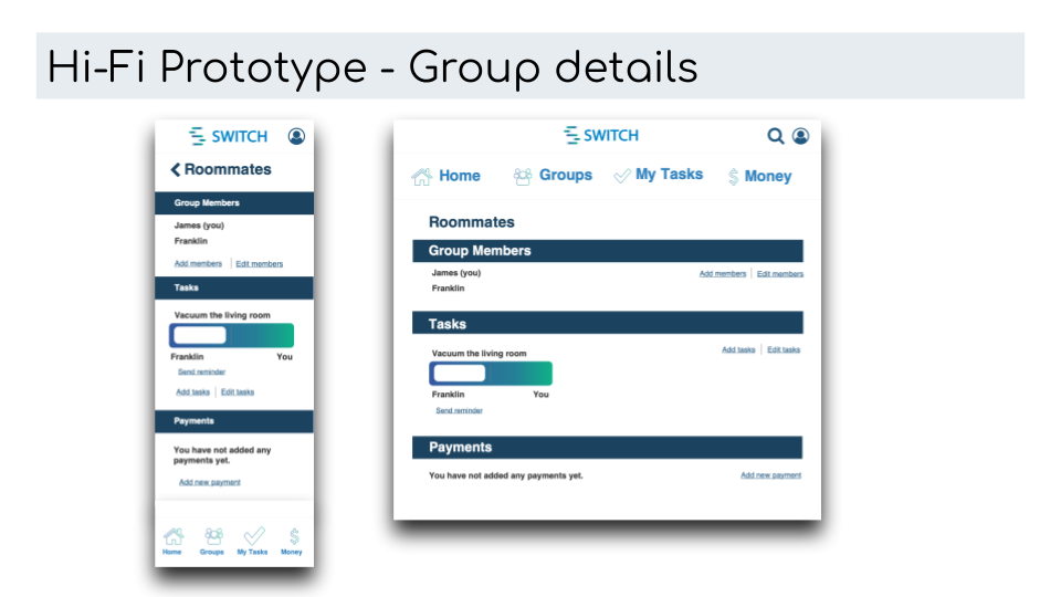
After we completed initial user testing and felt good about the changes made to the scenario, we were able to put together a hi-fi prototype. Some changes we made to the prototype to have it ready for production were:
Incorporating branded elements into the app and website - we created a logo and style guide that is to be used. This helps keep consistency among all pages.
Keeping the design simple - we removed anything that was adding clutter and ensured just the essentials, we also made sure section headers stood out and allowed for easy scannability.
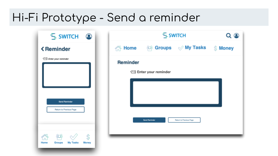
Incorporating recommendations - any recommendations within the scenario that users provided were incorporated. Specifically with button labeling. During the user test, there had been some confusion with the back button on the “send a reminder” screen.
The hi-fi prototype functions in the same way as the mid-fi prototype, so the same steps should be taken regarding Creating an account, adding a new group, adding a new task to the group, and sending a reminder
Conclusion/Final Thoughts
Don’t over complicate a simple problem and solution - we received some great feedback from the class after our presentation that helped solidify our push to not over-engineer our design and keep it to the necessities - this is a key lesson that we learned from moving forward with UX/UI.
Each step of the process is important - Low-fi designs are crucial to moving into mid-fi prototypes, and mid-fi wireframes and prototypes are crucial to move into hi-fi prototypes. Trying to jump ahead could cause a lack of structure and proper page layout which is crucial to the UX. Just because the UI design looks good does not always mean that the page is the best user experience - this is best alleviated by going through the entire process.


